Friday, December 27, 2013

Chanel Charming Eyeshadow Palette


Is it December already?  Late December?  The last few months have flown by - it all started with my organization's busy season in early fall, and escalated when we began rescheduling projects in anticipation of the government  shut down.  Luckily we weren't furloughed; instead, our work schedule intensified.  Some of us are recovering.  For a while I didn't have the time to blog (or read blogs), then I lost my momentum.  Ugh!

Anyway. I still managed to pick up some makeup, including Chanel's Charming palette.  I ordered mine from Nordstrom's Chanel studio in Seattle. As you probably know, it is one of the Limited Edition Ombres Matelassées de Chanel, and part of the Holiday 2013 Collection.  Chanel described the colors as soft beige to rich purple...offering "endless opportunities for custom-blending."


Well, no.  I was disappointed when I opened it because it is so plain looking, and particularly because the dark brown/gray shadow on the end doesn't look purple in the pan as  Chanel said it would, and it doesn't pull purple on me either.  The colors look pigmented enough when switched on my arm, but imminently dupable.  How could this be the centerpiece of the Holiday Collection?

Turns out that for my complexion, these colors are just pigmented enough to define my eyes without looking made up.  Like my eyes but better.  


The lightest color on the far left is a peachy pink, with the barest hint of shimmer.  The effect is a subtle, pearlized finish.

The matte taupe second from the left goes on a shade or two darker than than my skin tone, but I'm so accustomed to shimmer or colors that pop on my skin that this just looks blah to me.  I'll keep playing with it.

The center color is the most interesting one.  It's a medium brown infused with just enough golden shimmer to make the shadow glow a bit without adding that ashy, flashy,  sparkling look. Golden shimmer looks really good on warm skin tones - why is it used less frequently than silver?  I use this color on my entire lid and the lower to create a daytime smoky eye.

The brown second from the right is matte, though the shimmer from the medium brown almost always sprays over it, so it's hard to tell.  I use it most frequently on the outer corners, including on the bottom, blended well with the medium brown to complete that daytime smoky eye.

The darkest color on the far right is just an unremarkable brown/black. I use it sometimes instead of the dark brown on the outer corners.  Even when applied wet, it's still not really black, in keeping with the subtlety of the palette. 

Charming comes with two applicators, one double-ended sponge applicator, and the another with a sponge on one end and a brush on the other.  The sponge applicators pick up and apply lot of product without a much fallout.  The small brush was also handy for getting shadow into the corners. 

So why did I keep this palette despite my ambivalence you read here?  It's the only palette I have that gives a finished yet unmade up look that's perfect for meetings in a conservative organization or anytime you may just want to define your eyes.  I grumble when I put it on every morning ("$80 for brown eye shadow? You fool!"), yet I'm so pleased with the final polished look, which I haven't achieved with other palettes.  There are dupes, but they haven't created as subtle and sophisticated look as Charming.  Most of the time I can wear as much flash at work as I want but sometimes a look this subtle is perfect.  Was this Peter's last creation?  


Sunday, August 25, 2013

Chanel Healthy Glow Sheer Color (Les Beiges) in #40


I've been waiting for Healthy Glow Sheer Color SPF 15, aka Les Beiges, to come out since seeing them on the Canadian blogs.  I wasn't disappointed. 


Using the small half-moon brush that comes in the compact, a Nordstrom Pentagon City SA dusted #40 lightly over the powder foundation I was wearing that day.  I immediately loved the look - that natural radiance that Chanel claims Les Beiges is supposed to impart. Lit from within. I got the same result over liquid foundations and when worn on bare skin.  The bristles of the half-moon brush aren't very dense and only seem to pick up only a small amount of product, though enough to cover your blush if you're not careful. 

I also tried Les Beiges as  a  powder foundation using a traditional powder brush and Lisa Eldridge's buffing technique using a kabuki brush.  I didn't see much difference between them though I suspect that the kabuki technique uses more product and leaves more in the brush.  Les Beiges is not buildable so I needed to use a concealer for some areas.  The foundation brush and kabuki techniques covered these concealed areas nicely.  Here's how it looks as a powder foundation, applied with a kabuki brush.


The other products used included: Chanel Kaska Beige Eyeshadow Quad; Chanel Eyebrow Pencil #30 Brun Naturel; Chanel le Volume Mascara, Black; Guerlain Terracotta 4 Seasons #08 Ebony; Claudio Riaz Eye & Face Conceal 9; Chanel Lip Pencil, Nude; Chanel Glossimer #149 (discontinued).  Note to self:  CR concealer shows up in photos.

The effect of Les Beiges reminds me of T. le Clerc's loose powder, which I've been using for years, and reviewed here.  They never look powdery, even when first applied, and both give a "lit from within" look.

I don't understand the rationale for the color range that Chanel produced, though I would really like to know.  The SA chose #40 for me, which is slightly darker than my complexion, appears warm on my skin and gives me that healthy glow.  As a reference, I wear Chanel Perfection Lumiere #60. MAC NC45, Burberry Shear Luminous Foundation Trench 8, and LMdB Classic Flawless Finish #10.  I've read many contradictory reviews and color assessments of this collection.  I think it may be important to test it in store before purchasing.  I'm looking forward to experimenting with the other colors in the Les Beiges collection, especially for contouring. 

About the packaging:  I love the beige cover.  I wish though that Chanel would find a way to put the brush on the bottom of the compact.  It's really a PITA to deal with the loose protective cover that sits under the brush.

Have you tried Les Beiges?  What do you think of it?

Sunday, July 21, 2013

Chanel Mystere Quadra Eye Shadow and Khaki Precieux Stylo Yeux Waterproof Eye Liner


I wish Mystere, the quad in Chanel's fall collection wasn't limited edition as it fills an niche n my eyeshadow collection.  It's a brilliant neutral on my medium skin tone that pulls a subtle khaki  and clearly and subtly creates a different color tone than the grays and browns in my collection.


Rather than use all of the colors together for one look, I created two - one cooler and conservative, the other warmer and more sparkly.  I used the two bottom colors for the conservative look, applying the lighter, silver-infused satin taupe to the entire lid, and the darker matte khaki on the bottom right in the outer corners.

The two top colors are infused with a beautiful golden shimmer. The darker color is greener than the bottom color and the lighter color is a pale yellow.  Unlike the palest colors in other quads, this one has enough pigment so that it's actually yellow on medium-toned eyelids - I think the golden shimmer helps too.  It was hard to pick up the shimmer in the swatch photo below.


There was significant fall out when applied with a brush.  There was none when I used the sponge applicators that come with the quad.  I especially liked the narrow one that allows me to get into the narrow space in the outer corners of my eyes.

The Stylo Yeux Waterproof Eye Liner in Khaki Precieux is swatched on the far right.  It has a more obviously khaki hue than the quad and intensifies the quad's look.  I find that it glides more easily than Rose Or and Rose Plantine.  I love it.


Though these are fall releases, this beautiful quad and liner harmonize well with summer coral and orange lip colors I've been wearing (and my new yellow sweater set!).

I bought these at Nordstrom Pentagon City.


Wednesday, June 05, 2013

Spring Skin Care Regime: Jane Iredale's PurePressed® Base Mineral Foundation and Sun Screens


I've got my winter regime down:  I discovered that using cleansing oils and Josie Maran Argan Daily Moisturizer for day and Josie Maran 100% argan oil at night seemed to control my skin's oil production.  No need to blot throughout the day.  I was so pleased with the results that I've decided to continue it.  Realizing that some liquid foundations can make oily skin look oilier in warmer weather, especially those that provide more coverage, I turned to my powder foundations.  Obvious, right?  Well, it took me a while...
 My current fave is Jane Iredale's PurePressed® Base Mineral Foundation.  I bought my compact at a resort four years ago after discovering that I'd forgotten to pack face powder.  Back then the box and description didn't contain the word "foundation," so I didn't realize that's what it was.  I thought it was just powder that matched my skin tone perfectly.  It's all scratched up from rattling around in my handbag without its velveteen pouch for all that time! Too bad because it's refillable and I definitely plan to refill.


Photo from Jane Iredale.com


Here's my old compact - the color is Butternut.
 
It is sheer, it doesn't look cakey that is, even immediately after application.  It lived up its claim to act as a concealer - I simply dabbed a bit more over the areas in need.  I was really surprised that it covered the dark spots around my eyes even better than the concealers I've been using, though I still need to use a corrector to cover under eye circles.  No oily spots appeared around my nose around lunchtime (the first place oil appears).  I understand that you have to buff on most mineral foundations and this one comes with a round sponge, but I just dabbed it on with a fluffy foundation brush. It  wore for eight hours. It claims to be water resistant for up to 40 minutes, which I can't verify, but we'll see how it does when it gets really muggy and I begin to "glow" on my way to work!
 
You can purchase the full range of colors, from very light to dark, at Jane Iredale online.  Its color selection is meticulous:  it's broken down into three ranges of Neutral, Warm, and Cool, with light to darker shades included in each one.  (I wear Butternut in the Warm range.)  Nordstrom carries the light to medium colors but doesn't specify which range they come from. 
 
 PurePressed® Base Mineral Foundation also provides broad spectrum SPF 20 and UVA P++  protection (moderate UVA protection).  The Jane Iredale site provides this list of ingredients:
 
Active Ingredients: Titanium Dioxide 14%, Zinc Oxide 3%. Ingredients: Mica, Boron Nitride, Dimethicone, Stearic Acid, Plankton Extract, Algae Extract, Pinus Strobus (Pine) Bark Extract, Punica Granatum (Pomegranate) Extract. May Contain: Iron Oxides, Ultramarines, Chromium Oxide Greens.

 
I'm fine with this level of sun protection since the Josie Maran Argan Daily Moisturizer I apply under my foundation is SPF 40.  I don't spend a lot of time in the sun, but get some exposure during my daily commute.  After dark spots appeared around my eyes a year or so ago I've been more diligent in my use of sunscreen.  I dab the Iredale powder over the spots if not over my entire face before I leave the office in the evening.   
 
The recently released Australian sunscreen study confirmed that those "white people," to use the New York Times' term, under the age of 55 who "diligently use [SPF15] sunscreen every day can slow or even prevent for a time the development of wrinkles and sagging skin," but was inconclusive about the sun's affects on darker skin, because none were tested.  American doctors interviewed in follow up said that results for darker skin were likely to be the same though the sun's effects take longer to become apparent. 
 
There are other reasons to use sunscreen besides as defense against photo aging:  it is critical in the prevention of skin cancer, which people of color also get. The products I'm testing in an attempt to fade the dark spots around my eyes also advise using sunscreen because the tested areas become even more sun sensitive. 
 
Pink Sith has posted loads of very useful links about sunscreens in a review of Supergoop! SPF 50 Antioxidant-Infused Sunscreen Mist with Vitamin C.  I don't know about you, but I have found the subject of sunscreens confusing because there are so many kinds - some stable some not, some physical some chemical - which is which?  I only recently learned that sunscreens can deteriorate and/or expire.   Expiration dates are printed on the containers.  Check the dates before you buy.
 
Every spring Sephora sells a Sunsafety Kit containing travel-sized sunscreen products (and a bronzer or two) from a variety of companies.  This year's kit included Shiseido, Clarins, Peter Thomas Roth, Tarte, Josie Maran and several others.  I was really pleased that it also included a hand lotion from L'Occitane.  I always forget my hands and décolletage.  The kit sold out immediately this year, but they released a second round last year so keep your eyes open.  Most of the products contain chemical sunscreens - if you have no concerns about them, the kit's a great value and opportunity to try different products. 

What's your spring and summer skincare regime?  How do you fight the "oilies?"  I know I'll have to make adjustments when it get's muggy here!  What's your favorite sunscreen?


Tuesday, April 30, 2013

Hourglass Ambient Lighting Powder, Radiant Light


It took a while for Hourglass' Ambient Lighting Powders to arrive in the DC area, and given the range of opinion about them from angry disappointment to rave reviews, I thought I needed to check them out in person.

Only one of the shades worked for me, Radiant Light.  Its golden peach tone warms my face and it gives it a golden luminosity unlike other products that I've tried.  Upon close inspection you can see a fine golden flecks.  Its not sparkly like Chanel's Mouche de Beaute, just warm, bright, and, well, radiant.  It softens my face, as if in a candle-lit restaurant.  I love it.

It's not as translucent as Hourglass claims.  I accidentally applied too much the first time and almost completely covered my blush, so it requires a light hand.   If you apply too much it looks cakey and emphasizes pores. 


The swatch below is heavily applied with a sponge applicator.  The tiny golden particles appear in the photo, but they are barely perceptible on my face.  In fact, I never noticed them until I looked at my face with a magnified mirror.


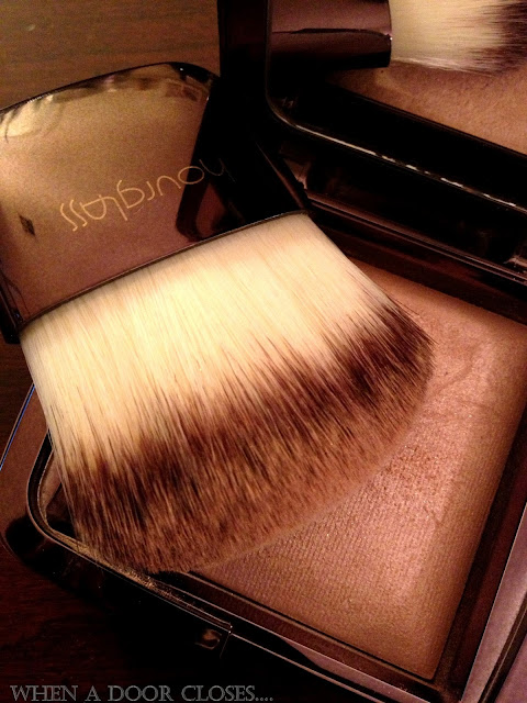
I bought the small brush Hourglass sells separately to use with the powders though applying with other soft, fluffy brushes works just as well.  I used an Essence foundation brush at first, which I bought at the drugstore, but the Hourglass brush is designed to fit the breadth of the compact, so makes for faster application.  It's about two inches wide, and soft and fluffy, and comes with its own pouch.  I suspect it will make a fine foundation brush as well.

The compact is plastic.  It would have been nice if it came in its own pouch too.


For whom this is important, the Ambient powders are free of parabens, talc, fragrance, nano-particles, and gluten.

I'm going to get a lot of use out this powder, I think.  Pinkish gold products suit my medium skin tone,  and it's very wearable for day since it does not add shine.  You could also use it as a very subtle highlighter.   I bought my compact from Marina at Space NK in Bloomingdales Tyson's Corner, 703-556-4569.  Marina is great with colors and she'll give you honest advice.  Give her a call. 


Saturday, April 20, 2013

Le Metier de Beaute Femme Fatale Kaleidoscope


I didn't have to think too long before deciding to buy Le Metier de Beaute's latest kaleidoscope, Femme Fatale.  I thought that I may have some of the colors already, but I am intrigued by blue this season, so I jumped at it.


Oyster is similar to the the two top colors in my favorite kaleidoscope, Le Cirque.  The camera picked up the pink, but doesn't capture the gold and gray shimmer, which make it the perfect base, in my opinion, because it will skew warm or cool, depending upon the other colors you use.   It's one of my favorite Le Metier colors, more complex than the camera can capture and very versatile.  I wish it came in a single.


Sapphire has beautiful copper flecks in it! It is darker than the blue in the Melange set, which looks like the single shadow Midnight Sky.  Sapphire is just dark enough to keep it from looking too '60s, yet light enough to be noticeably blue.  It's the shade I've been looking for.

Autumn Rust is an warmish taupe with a subtle shimmer that when applied next to Oyster, looks very elegant.

Matte Plum is very close to the plum in Le Cirque, just a tad darker.


I have more experimenting to do, but in my favorite look so far I applied Oyster over the entire lid, Sapphire as thick liner to the top and bottom lids, Autumn Rust over the outer two thirds of the top lid,  finishing with Matte Plum in the outer corner.  It's going to be one of my favorite looks.

I'm really pleased with this kaleidoscope.  As I said earlier, Le Cirque is my favorite kaleidoscopes, especially the two top colors.  I've actually hit pan on one of them, so I'm happy to have the semi-dupe in Femme Fatale.  Sapphire is precisely what I've been looking for blue, and I can't have too many purple shadows!  Femme Fatale is limited edition, and only available on Le Metier's new site.


Sunday, March 31, 2013

March Favorites


1.  Josie Maran Daily Moisturizer SPF40 and 100% Pure Argan Oil:  My skin is lot less oily since I've been using these daily and nightly.  It wasn't a surprise to the makeover artists and sales assistants to whom I've mentioned this.  Why hasn't anyone told us?  The daily moisturizer claims to defend against premature aging and reverse sun damage.  Titanium Dioxide and Zinc Oxide provide full spectrum sun protection again UVA and UVB rays.  They blend into the skin quickly and do not look ashy after application. The moisturizer also contains argan oil and other ingredients that you can review here.  I use the 100% Pure Argan Oil on my face and neck at night.  Neither contain
- Parabens
- Sulfates
- Synthetic Fragrances
- Synthetic Dyes
- Petrochemicals
- Phthalates
- GMOs
- Triclosan

I bought my traved-sized products at Sephora.

2.  Dolce and Gabbana Femme Fatale Eye Shadow Quad:  I've used this versatile quad almost everyday since I bought it.  It goes with everything in my wardrobe and I can change my look with different blush and lipstick or gloss.  See my full review here.

3.  Dior Nail Polishes  Dune 715 and Gris Trianon 306:  I'm a little late to the "greige" scene.  The these gray polishes look less stark with the inclusion of brown and cream undertones.  And they "went" with everything in this month's wardrobe.   The wear is fantastic:  minimum tip wear after seven days.  I used Dior's fast-drying topcoat.

4.  Hourglass Opaque Rouge Liquid Lipstick:  I love this one for the day-long meetings and conferences I attend.  Quite a lot of product comes out when you remove the wand and tends to collect on the edges of the lip, so I apply to the center first then work out.  It dries down to a matte finish and feels a little tacky if you press your lips together.  It lasted through the morning and most was still on after lunch.  The colors shown on the Sephora and SpaceNK aren't as bright as they actually are, so I encourage you go see them for yourself.  The pink and orange are quite bright and will be perfect for spring and summer.  The color here is Icon.

5.  Chanel Stylo Yeux Waterproof Longlasting Eyeliner Or Rose:  I almost returned this one.  I found that it drags when I try to apply it as a traditional eyeliner.  But I love the way its golden rose color brightens my eyes when applied on the lower inner lid and on the waterline. 

6.  T. LeClerc Eyeliner Pen:  Until I bought another brand of felt tip pen, I didn't appreciate how the length of the tip - about 3/4" - makes application so much easier especially along the upper waterline and when using the point to apply between the lashes.  It's waterproof so it stays put, only showing signs of wear by the end of my working day. 

What were your faves this month?

Tuesday, February 19, 2013

Dolce and Gabbana "Gems" Smooth Eye Colour Duo


 It comes with two sponge applicators, which I promptly lost!


Gems is a fabulous alternative to the usual brown, black, or blue smoky eye look.  These plum shadows don't look as though they go together, but they blend beautifully on the eyelid.  The lighter color on the left has the slightest bit of pink and purple sparkle, not really enough to notice from afar, but enough to give it some interest.  The darker shadow on the right is a deep plum/purple.  With a light hand it goes on sheer, and can be built up to a deeper hue.  I created a number of nice looks using the lighter color on the inner lid top and bottom, the darker color on the outer corners and as a bottom liner, and Chanel Or Rose waterproof liner on the inner lower waterline and below, blending well in the middle.  The darker color also looks great as a wide liner on the lower eye.  Done in black it would be too much, but in this shade it looks great.  These shadows don't need an under brow highlighter, but the white shadow in Femme Fatale makes a  pretty and subtle one.  They are long lasting, showing no sign of fading after 10 hours:  from 8am this morning until 6pm without a primer.  Like Femme FataleGems blends easily, and there's virtually no fall out. 


It isn't too dramatic a smoky eye for me to wear to the office, but I still didn't want too strong a lip so I wore the Dolce and Gabbana brownish pink lip gloss Praline  (discontinued, I think), lined first with a light coating of Chanel Brown Copper Aqua Crayon lip liner.  I covered the liner completely with the gloss so that my lips didn't look obviously lined, yet kept them from disappearing into the planes of my face.  Rock and Republic Bedroom was the blush of the day as well as NARS Pure Radiant Tinted Moisturizer in "Malaga."  "Malaga" is a little too dark for this time of year, but it wasn't that noticeable!


Gems was a gift from Dustin Lujan at Saks in Manhattan.  You can call him at 212-940-4949 to consult about Dolce and Gabbana products and colors, especially since the colors on the Saks website are not true.  Tell him I referred you.  While I trust him implicitly to choose colors for me, I wish we had Dolce and Gabbana here in Washington so that I can play

Thursday, February 14, 2013

Chanel Mouche de Beaute Illuminating Powder


"This exclusive creation, a precious powder in an elegant gold shade enhanced with pink highlights, delicately illuminates the angles of the face with an exquisite effect."


After several seasons of illuminators that didn't work for me, I really looked forward to testing this one, expecting that that its rose gold undertones would suit my complexion. While it is a beautiful product, I found it too sparkly for day or office.  It doesn't illuminate, but highlights instead; "illuminate" suggests a more subtle effect than Mouche de Beaute gives.  The product adds the slightest bit of pink coloration; the gold cast disappears on my skin completely, adding only a colorless sheen.  The aforementioned sparkles leave a beautiful finish atop the cheekbones and under the brow bones, but it's not subtle enough to use in other areas typically highlighted, such as down the center of the nose, chin, or atop the inner brow.  

Mouche de Beaute comes in pouch with a large sponge applicator.  Those of you interested in a sheerer effect might want to try using a dense brush. 


I bought Mouche de Beaute ($80) from Ondrea Watson, Chanel Studio Counter Manager at the Seattle Nordstrom Flagship store, 206-628-2111. It's also available at Chanel.com.  

Wednesday, January 30, 2013

Dolce and Gabbana Femme Fatale Eyeshadow Quad


Dolce and Gabbana's Dustin Lujan, at Saks in New York, choose Femme Fatale to use in my makeover weekend before last. I would never have chosen it on my own. There are gazillion taupe quads out there, but they aren't all equalFemme Fatale, as you can see, contains a winter white, mauvish taupe, medium and dark brown.  The difference between this one and the others I've tried is the rich pigmentation, which makes all the difference, the finely milled texture, and the amount of shimmer added. 


The mauvish taupe is an excellent, if unexpected, base for the medium and dark browns in the quad.  It isn't noticeably mauve on the eyelid and has enough pink and gold shimmer to keep it from looking flat, giving it a satin finish instead.  The medium and dark brown shadows are matte, richly pigmented, and finely milled, making them super easy to blend.  They feel almost creamy when blending with fingers.  The degree of pigmentation makes them look as though actual shadows are cast on my eyes, instead of blocks of ash sitting atop my skin as so many others have.  The medium brown is dark enough for me to use in the crease for a nice office look; the darker brown creates a more dramatic look.  Both also look great as liners, dry or wet.  The winter white has just enough shimmer to give it depth, but not so much that it appears as a gash of metallic silver under your brow, or so little that it is just a blot of white.  There was a tiny bit of fall out when applying the darkest brown as a dry liner, but none from the other colors.  I noticed just the slightest bit of fading after eight hours. 


These swatches were applied with the sponge applicators that came with the quad.  The medium and dark browns can be built up to much darker shades, the darkest one almost black.  I love that all four colors in this quad will work beautifully for a wide range of skin tones, from the fairest to the darkest.  Here's another staple for my arsenal.


Dustin used Stromboli in these photos, an olive green liner shot with gold flecks, which I liked a lot.  I'll swatch Stromboli for you in another post.   I'm going try using other liner colors with this neutral quad to achieve different looks.  It has been so overcast here lately that I decided to inject some brightness in my makeup this week.  I used Femme Fatale with the Stromboli liner, LMdB Peau Vierge Anti-Aging Complex as my foundation, a bronzer, and the golden Dolce and Gabbana lipgloss named simply Gold (pictured in this post) over a light rust-colored lip liner.  My face looked bright, and I felt bright!  
 
I bought Femme Fatale from Dustin Lujan at Saks.  Call him at 212-940-4949 to consult about products and especially colors since those shown online are not entirely inaccurate.  Or visit him in the store.  Tell him I sent you!
 

Sunday, January 27, 2013

Vogue Knitting Live 2013 and Some Makeup


View from the 26th floor Marriot Marquis in Times Square.  I could barely approach the window!

Thank goodness the snow arrived this week instead of last when I was in New York.   I went there primarily to attend Vogue Knitting  Live (VKL) at the Marriot Marquis, and while I would never have had to have left the hotel for VKL events, I wouldn’t have visited the Fashion District or shopped for makeup.  To get right to the point, VKL New York was a bit of a disappointment this year.  I arrived at my hotel about noon on Friday and went straight to the yarn market only ot find that it was a zoo already.  The usual complement of vendors were there, crammed into small spaces on two floors.  I had to fight my way into the Habu booth.  I was interested in finding some mercerized cotton yarn and any kind of Habu, but everything looked a big blur of sock and novelty yarn.  For the first time ever, I was faced with yarn and bought nothing. I was tempted this Habu Cotton Gima:


But I decided to just take a photo and order later if I decide what to make out of it.

I took one class on knitting peblums.  Granted, I learned something new, but I could  have done the same by reading instructions in a book or finding them on the Internet.  A class should have value added not readily translated into written instructions, in my opinion.  The instructor did have an interesting story about her work with Ralph Lauren, but it would have been even more itneresting if she had had a garment or two of her own design to show us and if she had shared more of her experiences as a knitwear designer.  The Vogue fashion show, so inspiring last year, was full of pedestrian designs and didn’t live up the Vogue name.  While the Marriott Marquis was comfortable hotel, the Hyatt, where it was held last year, was a better venue for Vogue Knitting Live.

This is not to discourage attendance to VKL generally.  I realize that these events are dependent upon hotel availability and the instructors the organizers are able to recruit; the Chicago class roster looked much more interesting for instance.  Also, there were a couple of three-day long design classes that looked interesting, but that I couldn't take because I could only stay in New York for two days. 

That said, it was good to be around knitters and my roomie, Diane.  We talked about knitting, design, bounced ideas off of each other, and tooled around the Fashion District looking for beads for her class, notions at M & J Trimming, and got a makeover for her at the Meatpacking District Sephora.  It was also great to see Shirley Paden, master knitter and designer.  Shirley, by the way, will be back in DC in February to teach her day-long design class and finishing class at Looped Yarn Works near Dupont Circle in DC, February 15-17.  I highly recommend it.  You can read my review here.

I also got to visit with my buddy Dustin Lujan at Saks.  Dustin works for Dolce and Gabbana Beauty now and gave me a beautiful makeover.  Here are some of the things I got:

D&G 2013
 

I’ll write a full review in other posts, after I’ve had a chance to take decent photos, but will say that the taupes in the quad are a good match for my skin tone, which is unusual.  Most taupes just look like a blot of gray on my eyelids, but these look like a natural enhancement – i.e. actual shadows.  The green eyeliner works surprising well with the taupes, giving them a different look.  The concealer is the best I've used, and as others have said, the Passion Duo lipstick is luscious. 

Naomi Yasuda, celebrity manicurist and creator of Barneys Lady Gaga Nail Collection, was giving free D&G manicures that day.  Many of her nail designs are over the top for me, but she gave me a pretty lace and crystal manicure, which I will remove with great reluctance.


Naomi Yasuda D&G Mani
the crystals are not as milky as they appear in the photo.
 
I visited several Sephoras (they all seem to have different stuff).  The Times Square store had nail stations stocked with a variety of polishes and removers where customers can try on different looks.  I wish the Sephoras here had those. The stations were a mess thus no photos.  The stores in Time Square were just as crowded as the Square itself; Sephora did not seem to be sufficiently staffed to keep things in order.  The Soho store was just as crowded, but clean; had no nail bars, but they did have Edward Bess.  I wanted to look at his new eye shadow quads in person after seeing them all over the Net.  Given that eyeshadows look different on the eyelid than on the back of one’s hand, I should have tried them on, but they looked dupable out of my own stash, so I passed on them. 
 
The Meatpacking District Sephora was very elegant, which is not a characteristic that comes to my mind when I think of Sephora.  I should have taken photos, but I got totally caught up Diane’s makeover, then by actually looking around.  The store was bright enough to properly show the products, but not starkly bright like other Sephoras.  The walls were dark and potted orchids were scattered about.  Applicators and cleansers discretely placed around displays - so discrete they were almost invisible.  There were no cashiers; each sales assistant had an iPhone equipped with a price scanner and a credit card swiper.  Like the other stores, they carried Dolce and Gabbana and Giorgio Armani (surprise! I didn’t know Sephora carried Armani cosmetics).  Diane, who is not a makeup junkie, needed some basic products that she can apply easily and quickly with little fuss.   A sales assistant listened carefully to our requests and explanations, then sat her down at one of several clean and neat, mirrored stations and brought out some products out for us to consider. Here's what she got:
 
 
Diane's stuff  
From top left:  Marula Facial Oil; Hourglass Illume Creme-to-Powder Bronzer Duo; Bite Lipstick; Fresh Sugar Lip Treatment; Makeup Forever eye pencil; Anastacia tinted brow gel; Dr. Jart+ Waterfuse Smart Gel (BB Cream)
 
The sales assistant was very good.  As Diane commented, she really heard what we said, and nailed suitable colors for Diane at the first go.  We were really impressed.  I enjoyed helping Diane navigate products, decide what she really wanted and would use, and make recommendations.  Now I want to shop for my other friends! 
I bought a couple of things there for myself too, and at Inglot, which I will review later. 

I did not see my DC knitting pals; I know that some stayed in Washington for Inauguration events.  Did you go to Vogue Knitting Live?  What did you think? 

Friday, January 25, 2013

Sneak Peek: CHANEL Hong Kong Collection


For the opening of the new CHANEL fashion boutique in Hysan Place in Hong Kong, Peter Philips has created three exclusive products:  an eye shadow palette 'Ombres Matelassées' and two nail polishes.

This is a new interpretation of the 5 Ombres palette launched for the opening of Montaigne in 2012.  Its name is "Pearl River," recalling the reflections of the Chinese sea surrounding the city.  I'm loving these warm colors. 

The two contrasting nail polishes are named "Eastern Light" and "Western Light," to represent Chanel's vision of Hong Kong as representative of the perfect meeting point between eastern and western cultures.
 
Eastern Light, "an opaque white."
 

Western Light, "deep chocolate with a heart of pearly red." 

Having missed Chanel's chocolate nail polish years ago, I'm eager to see this one.

This exclusive collection will be available in February at Chanel Studios, including the Nordstrom Flagship Store in Seattle.  Call Ondrea Watson, Chanel Studio Counter Manager at 206-628-2111 for pricing and to preorder.

Photos and product descriptions from CHANEL.


(Edited for spelling.)


Thursday, January 10, 2013

Chanel Rouge Allure Velvet La Raffinee and Glossimer Paillettes

I use Chanel D'Ombre Emerveille as a base and highlighter with the new Chanel Raffinement eye shadow quad, which warms up the look a bit.  The few pinks in my lipstick and gloss collections are on the cool side so I needed new colors to go with my new eyeshadow look. One of my favorite Chanel makeup artists, Mikhal, coaxed me into trying two products in colors outside of my comfort range, Chanel Rouge Allure Velvet La Raffinee and Glossimer Paillettes.

La Raffinee, like the Raffinement quad, is rather unremarkable just too look at it. It's a kind dirty candy pink, with no hint of mauve.  It's no wonder I never bought it.  But it looks great applied. 

 
La Raffinee and Paillettes


La Raffinee and Paillettes V
 
 
 The Glossimer Paillettes is also a warm pink and pretty when worn alone.  La Raffiinee becomes brighter with Paillettes applied over it.   
 
 
La Raffinee and Paillettes VI
 
La Raffinee, Paillettes glossed over La Raffine, Paillettes
 
Mikhal lined my lips with a medium brown pencil first, applied La Raffinee, then dotted Paillettes in the center and spread toward the edges fading just before reaching the lined edges.  The darker liner just prevents me from looking like my lips are walking in the room first.  I use Rock and Republic blush Bedroom, also a muted pink, to finish the look.  (Don't you wish they'd bring Rock and Republic back?)

ShareThis

Related Posts Plugin for WordPress, Blogger...