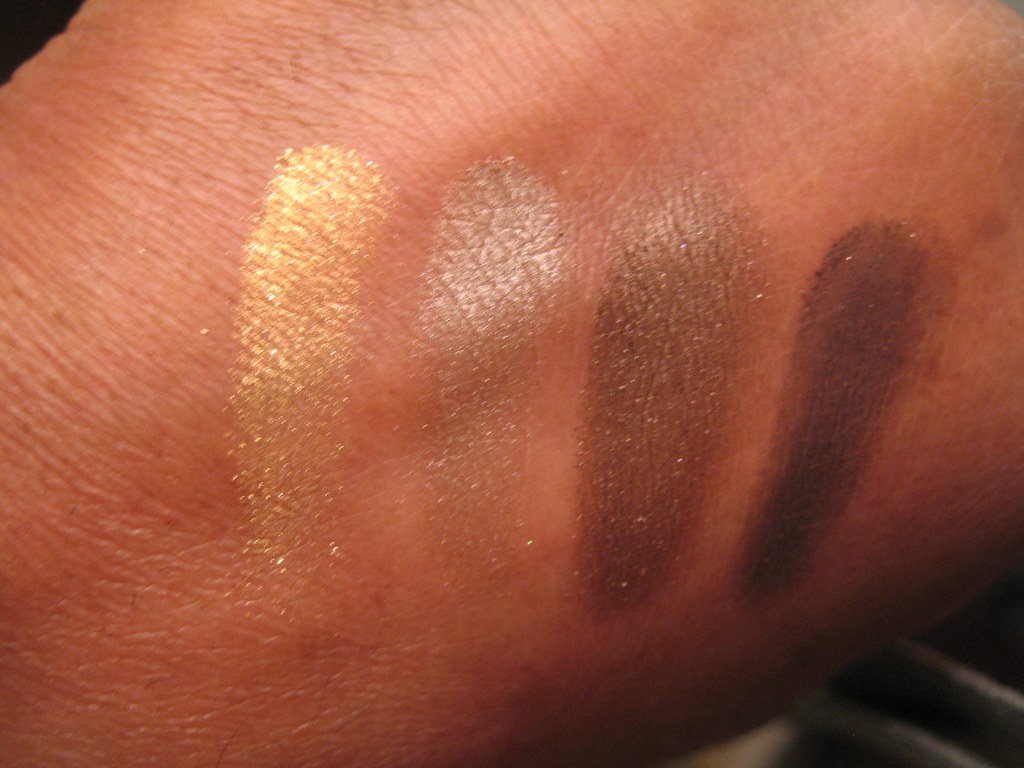
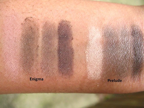
Topkapi is a beautiful quad. I was unimpressed when I first opened it because the colors looked like others I've seen, i.e. brown and gold. And the names of the colors are simple, Gold, Taupe, Copper, and Bronze. But upon closer inspection, it became apparent that the color described as taupe is actually closer to pewter, and goes on as such. It is unlike any color I've seen. All the shadows are perfectly pigmented, and more finely milled than most other shadows I have.
I've swatched them below with a sponge applicator and without a primer. There is more shimmer than found in most quads, but not too much.
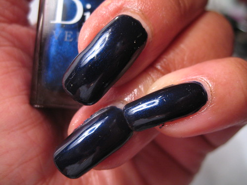
Taken indoors
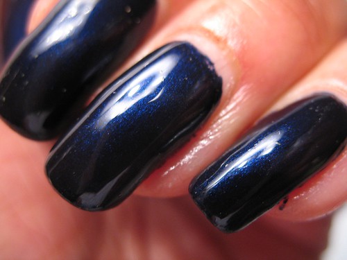
Taken outdoors
I applied the shadows on my eye with a small YSL eyeshadow brush that came in a GWP, which picked up almost as much color as the sponge applicator. That's unusual. I've learned that this may be attributable to the brush, rather than the shadow, but given that the same happened with the sponge applicator, I'm giving credit to the product. It did not seem as though the brush had picked up much when I swiped it across the shadows, particularly the pewter and the gold, but when I brushed them on my eyelid, a rich wash of color appeared. Wow. This may call for a back up.
Taupe is applied on the lid below the crease.
Gold applied lightly over the the taupe in the inner half of the lid.
Bronze, the lighter brown, applied the in the crease and winged out.
Copper, the darker brown, used as eyeliner.
Edward Bess' Afterglow All Over Seduction used as a highlighter under the brow.
YSL Noir Radical Mascara.
Chanel suggests other applications on their site. You can toggle between the
Byzance look, and the
Empress Theodora look. I'm eager to try out the double-winged liner on Theodora!
My only criticism is that it fades after a few hours. I hope my new favorite eyeshadow primer by Nars will take care of that.
Topkapi is part of the limited edition Collection Byzance de Chanel, which can be purchased on Chanel's
site, and at Chanel boutiques and salons across the US. I bought mine from the Nordstrom Chanel Salon in Seattle, 206-628-1054. Ask for Phillis. I have no affiliation with Nordstrom or Phillis, she was just very helpful and followed up when shipping my package. Be warned, Topkapi is going fast.


